
Customers are more fee-sensitive than ever. This guide shows how to make pricing, tips, and surcharges clear and consistent at the counter so you protect margin without losing trust or slowing down checkout.
Checkout is a trust moment.
When customers feel surprised by fees or pressured by confusing tip screens, they do not just get annoyed - they start to doubt everything else. And that doubt turns into fewer return visits, more disputes, and more "let me think about it" hesitation at the counter.
The fix is not to eliminate every optional charge. The fix is to make the total feel predictable and explainable.
Why this matters more in 2026
- Customers compare prices faster (in-app, on maps, on social).
- People are watching receipts more closely.
- Bad checkout experiences go viral fast.
If you run retail, a restaurant, or services, the winning move is simple: design checkout so a customer can understand their total in one glance.
The 3 places surprise fees usually show up
- At the menu / shelf: signage is outdated, or the item has hidden add-ons.
- During checkout: modifiers, fees, or surcharges appear late.
- On the receipt: labels are vague, or the math is hard to follow.
The goal is to make those three places tell the same story.
A practical playbook you can use this week
1) Write your fee story in one sentence
For every fee or surcharge you use, write one sentence that your staff can say without cringing. If the sentence is complicated, customers will assume it is sketchy.
2) Disclose early (boring is good)
Customers accept charges more easily when the information shows up before the moment of payment. Early disclosure lowers conflict and speeds up the line.
3) Make the receipt read like a simple narrative
- Items
- Discounts (if any)
- Fees (if any, clearly labeled)
- Tax
- Total
4) Tip screens should feel optional, not forced
Two rules help a lot:
- If you are not a tipped environment, consider removing the prompt entirely.
- If you do prompt for tips, keep suggested options reasonable and include an obvious "no tip" choice.
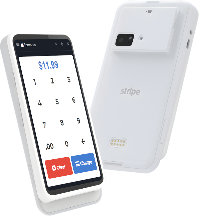
5) Build consistency into the POS, not into someone's memory
If fees are applied "when the cashier remembers" you will get chaos. Put the logic into your POS configuration so every transaction is handled the same way.
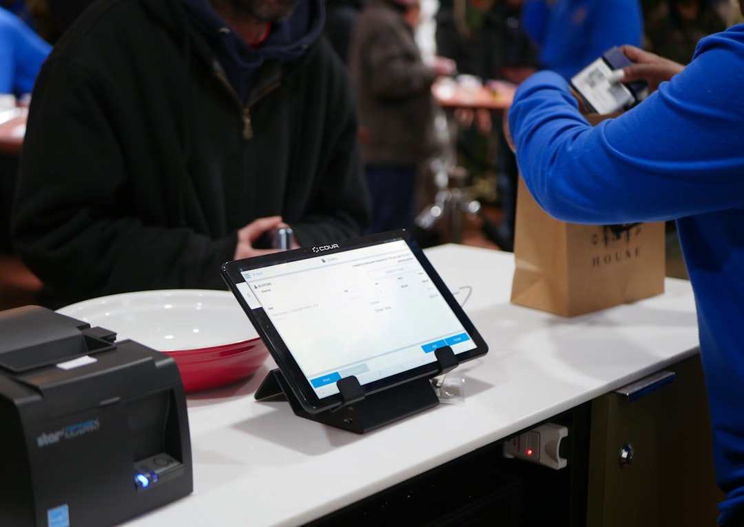
Where M&M POS helps
Transparent checkout is easier when your POS keeps items, taxes, discounts, and receipt labels clean and consistent. M&M POS is designed for fast real-world checkout, and it supports an itemized flow that customers can understand.
If you want to audit your checkout experience, install download M&M POS and run a quick self-test: ring up three common orders, one discount, and one refund. If anything is confusing to you, it will be confusing to customers.
The takeaway
In the no-surprise-fees era, clarity is a competitive advantage. When your pricing story is consistent across signage, checkout, and receipts, you reduce friction and you keep customers coming back.