
AI-driven recommendations can bring you highly qualified shoppers - or drive one-and-done clicks. Learn how to design a "validation layer" on your website and checkout flow so AI referrals turn into repeat customers.
A customer sees your business recommended by an AI assistant, taps your link, and lands on your site.
This is the moment. Not your logo. Not your origin story. The moment.
Because AI referrals behave differently than classic search. People arrive with more context (they were just reading a summary), but they also arrive with more skepticism. If the reason-to-believe is not obvious quickly, they will bounce and never come back.
We call the fix the validation layer: the handful of page elements that confirm, in seconds, that you are the right choice and that buying from you will be smooth.
Why AI referrals can be "love you or leave you"
Traditional search traffic often comes from someone already intent on finding a business. AI referrals often come from someone intent on solving a problem.
If your site does not immediately connect to that problem, the AI recommendation stops feeling helpful. The shopper thinks: "Maybe that was wrong." And they back out.
The validation layer: 7 blocks that reduce uncertainty
1) The 12-word clarity headline
Your first line should explain what you do in human language, not a slogan. Examples:
- "Same-day phone screen repairs in downtown Springfield."
- "Fresh lunch bowls, ready in 8 minutes or less."
- "Mobile dog grooming - we come to you."
2) A visible "how to buy" path
Do not make people hunt. Put the next action in the header:
- Order online
- Book an appointment
- Call now
- Get a quote
3) Price range signals
People do not need an exact quote. They need to know if you are in the right universe. Show:
- starting prices
- typical ranges
- what is included
4) The "what happens next" explainer
This is the most underrated conversion lever. A 3-step explanation reduces fear:
- Step 1: Choose items / request service
- Step 2: Confirm timing (pickup, delivery, appointment)
- Step 3: Pay and receive receipt
5) Real photos, not stock vibes
AI referrals amplify trust issues. Real photos fix that. Show:
- outside shot (so customers recognize the place)
- inside shot (so they know what to expect)
- product or work samples
6) Policy snippets
Returns, cancellations, and warranties are anxiety reducers. Add a short block with the basics. Make it readable.
7) Proof from other humans
Do not overthink it: a few short testimonials, a recognizable review platform mention, or "trusted by" logos (only if true) can help. Keep it honest.
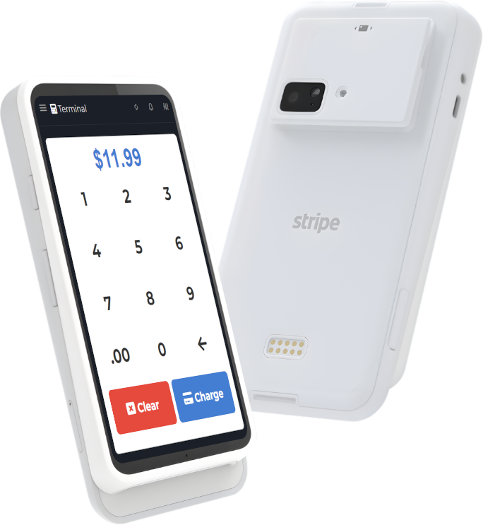
Where POS fits (and why it matters)
Here is the engineering angle: most "conversion" problems are not design problems. They are data consistency problems.
If your website says one thing and your checkout says another, the AI referral breaks trust. Examples:
- your site says "open" but your store is closed
- your menu says $9.99 but checkout rings $12.49
- your booking page promises 30-minute turnaround but staff cannot deliver
This is why we like POS-first marketing. Your POS is where the truth of pricing and offerings should live. If you can keep that clean, your website can be accurate without heroic effort.
M&M POS helps small businesses keep items, pricing, categories, and receipts organized so your online presence matches what happens at the counter. If you are setting up or rebuilding your workflow, download M&M POS and start by making your top sellers easy to understand: clear names, clear variants, and clear pricing. That one cleanup improves everything downstream, including AI referrals.
A story you can borrow
Imagine a customer lands on your site and sees:
- a clear headline
- a "Order now" button
- a price range and timing
- a short policy snippet
- a few real photos
They do not need to think. They click, order, and move on with their life. That is what "good marketing" looks like in the AI era: less persuasion, more certainty.