
Even in a touchscreen world, physical buttons and clear tactile interactions are resurfacing. Here's what that trend teaches small businesses about building a faster, more accessible checkout flow-and how to audit your POS screens like a product team would.
There's a tiny trend hiding inside a bigger one: after years of "everything is a touchscreen," more products are reintroducing physical controls.
It's not nostalgia. It's usability.
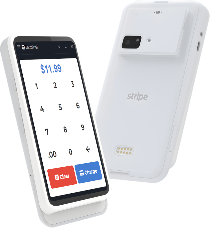
When you run a small business, checkout isn't a design concept-it's a performance. And your POS interface is the stage. Every extra tap, every ambiguous button, and every hard-to-read screen turns into seconds. Seconds become lines. Lines become stress. Stress becomes mistakes.
The lesson: friction shows up first in the hands
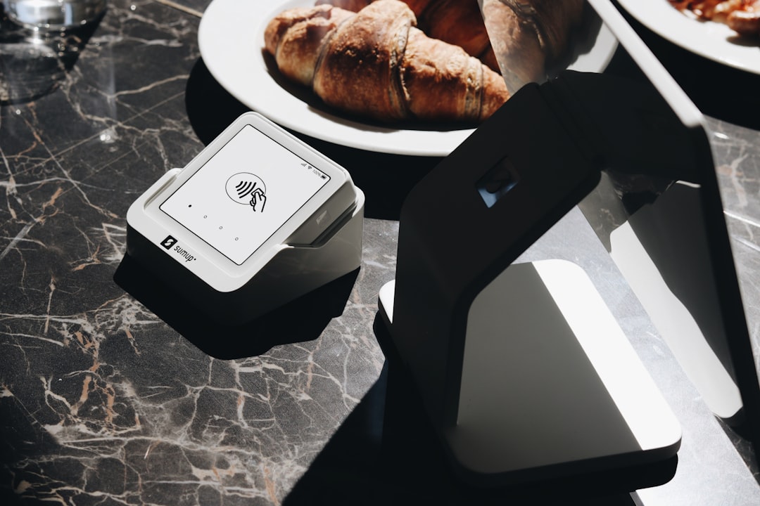
Touchscreens are great-until they aren't. In real environments, screens are:
- glared by sunlight
- tapped with wet hands
- used with gloves
- shared across multiple staff with different comfort levels
- used by customers with different accessibility needs
Physical buttons (or tactile patterns) reduce decision fatigue because they offer certainty: you know you pressed something.
A POS UX audit you can do in 30 minutes
If you want your checkout to feel "faster" without changing anything about your products, audit your POS like a product team would.
1) Time the "three common transactions"
Pick three real scenarios you do all the time:
- your most common sale
- a sale with a modifier (size, add-on, discount)
- a refund or exchange
Time them from the moment the customer is ready to pay to the moment the receipt is done.
Don't optimize yet. Just observe.
2) Count taps and context switches
Every time the cashier has to "hunt," you lose flow. Count:
- number of taps/clicks
- screen changes
- moments where staff pauses to think
Those pauses are where physical buttons used to shine: the action was obvious.
3) Check readability like you're seeing it for the first time
Try this: stand at the customer side of the counter and glance at the screen.
- Can you read item names without squinting?
- Are prices obvious?
- Is the "pay" action visually clear?
Accessibility isn't only about compliance. It's about reducing "oops" moments.
4) Make the "escape hatch" unmistakable
In a busy environment, you need one or two obvious ways to recover:
- void last item
- cancel transaction
- back to cart
This is where tactile thinking matters: the escape hatch should feel like a physical button in the brain-always reachable, always predictable.
Engineering perspective: consistency beats cleverness
Teams building software learn this quickly: clever UI feels fun until you run it under pressure. Consistent UI wins because it produces fewer edge-case errors.
For a small business, the best checkout interface is the one your newest employee can use correctly on their second day.
Where M&M POS fits
A POS should feel calm under pressure: clear buttons, predictable flows, and fast product search. M&M POS is built around that idea-helping small teams move quickly without turning checkout into a puzzle.
If you want to run the 30-minute UX audit above, install download M&M POS, ring up your three common transactions, and see how the flow feels. The point isn't to chase "modern UI." The point is to make checkout reliable-for staff and customers.
The takeaway
The comeback of physical buttons is really the comeback of certainty. You can't always add buttons to your POS hardware-but you can design your checkout flow so the main actions feel unmistakable. Faster checkout is usually a UX decision first, not a staffing decision.