
Accessibility is not just a legal checkbox. It is a speed feature. Here is how to make checkout easier for staff and customers: contrast, touch targets, language, and error recovery.
Accessibility is a sales multiplier
Most owners hear "accessibility" and think: compliance, legal risk, and paperwork. But at the counter, accessibility is something much more practical: it makes checkout faster.
When a POS is readable in glare, usable with one hand, and forgiving when someone taps the wrong thing, your line moves. Your staff stress drops. Your customers feel taken care of.
Four accessibility principles that also boost speed
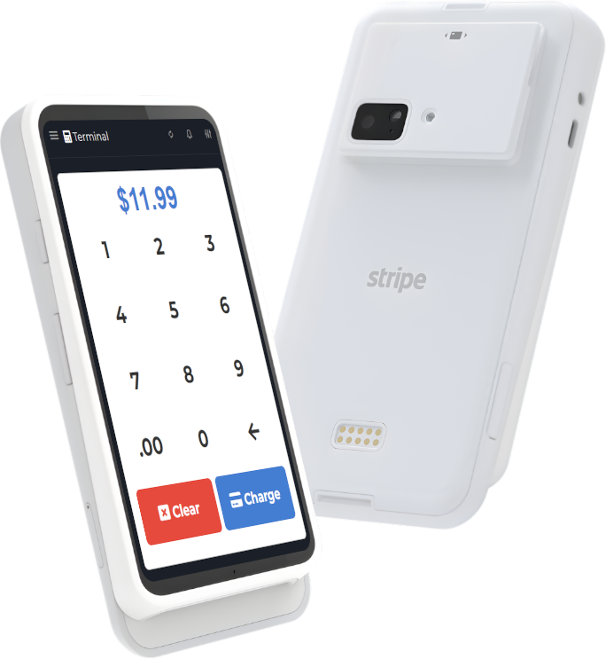
1) High contrast and predictable color
Low contrast looks "modern" in a design tool and fails immediately under real lighting. Use strong contrast for:
- item names
- totals
- primary actions (Pay, Save, Send)
Operational tip: do not rely on color alone to communicate status. A red number without a label is just stress.
2) Big touch targets (especially for the actions that matter)
Small buttons are a hidden tax. They cause mis-taps, which cause corrections, which cause awkward customer moments.
Make these actions big and distinct:
- Add item
- Quantity
- Discount (if allowed)
- Pay
- Back/Cancel
3) Fast error recovery (because mistakes happen)
A POS that assumes perfection is fragile. A POS that expects mistakes is strong.
For checkout speed, the best feature is: undo. If your system cannot undo easily, you need at least:
- clear confirmation prompts for destructive actions
- line-item voids (not only full-ticket cancel)
- receipt reprint and resend options
4) Language and labels that match how staff talk
If your button says "Finalize Transaction" but your staff says "Pay", you created a training problem. Labels should match the store's vocabulary.
Same for item names: keep them short, consistent, and searchable. Do not let a menu turn into a novel.
A quick self-audit you can do today
Stand at your busiest register and run this test:
- Can you read totals at arm's length?
- Can a new hire find your top 10 items in under 10 seconds?
- Can you complete a cash sale without switching screens?
- Can you undo a mistake without calling a manager?
- Can you finish a sale one-handed while holding a product?
If any answer is "no", that is not a personal failure. It is a system design issue.
From a product/team perspective: build for the real world
Teams that build POS software sometimes test in perfect conditions: good lighting, quiet room, calm user. The counter is the opposite: noise, glare, interruptions, customers asking questions mid-tap.
When we evaluate POS workflows, we look for "stress tolerance": does the UI stay understandable when everything is chaotic?
Where M&M POS fits
If you want a POS that prioritizes clarity and day-to-day usability, start with M&M POS. A readable UI, clean item structure, and simple correction flows are not luxuries, they are throughput.
Want to see how your own menu and pricing feel in a clean checkout UI? download M&M POS and try a few real transactions (including one mistake on purpose). That single exercise will reveal more than a long feature comparison.
Accessibility upgrades that usually pay for themselves
- Enable a high-contrast theme (or increase default contrast where possible).
- Increase font size on totals and primary buttons.
- Reduce clutter: remove rarely-used buttons from the main flow.
- Standardize item names and modifiers.
- Teach one consistent "undo/correction" flow store-wide.